| |
|
| |
| Interview
with Jim Modiano |
| Beverly
Weiss, sculptor |
| You
spent years painting landscapes directly from nature. How does
your experience of nature currently affect your work? |
| My work
is everywhere informed by my experience of nature. I spent
many years immersed in the natural – both while studying
it at the microscopic level and while living in it. Painting
landscapes en plein air, I was given over to the
totality of the experience of raw, unadulterated nature. My
focus was on the entirety of the natural environment; the
all-encompassing system, the balance hewn from imbalance,
the ecology. I was subjective and I was emotionally engaged.
These are the roots of my abstraction. |
| Is
that what you would expect viewers of your art to see? |
I
have no expectations of what my audience will see. But yes,
I would hope that viewers come away with a sense of nature
as totality and interdependent parts. My overarching goal
is to imbue the work with specific emotional content that
will resonate with viewers of the paintings.
In this sphere
of abstraction, the emotional content is carried by the colors
and shapes. There is no question in my mind that they are
sufficient means to exact an emotional response – Matisse’s
la Chapelle du Rosaire in Vence is proof positive
that this is so. And of equal importance to me is that the
elicited response is not primarily cognitive, but perceptual.
|
| Do
you relate the colors in your palette to specific elements? |
If
by elements you mean earth, wind, water, etc., then no. I
am simply not that premeditated. My lack of intentionally
does not preclude the viewer from ascribing meaning to the
colors presented, though. And of course, I can’t exclude
the possibility that my color choices are unconsciously guided
by my deep-seated impressions of nature. Right now I can say
with certainty that I relate the colors in my palette to each
other. They describe a kind of system that provides me with
a range of interactions – of balance, harmony, and contrast
– well suited to my present purpose. |
| The
colors in your paintings have a special vibratory quality -
would you describe how this happens? |
Well,
I can try. Basically, I am working with color contrast. The
vibratory effect you are referring to is the result of the
colors being equiluminant, or in other terms, the colors have
the same value. This lack of color contrast confounds aspects
of our visual processing so that we cannot fix one color field
over the other. In addition to vibrations, the equiluminant
areas enhance any figure/ground reversals.
At other times
I employ an effect known as simultaneous color contrast. This
is when a single color appears to shift in tone depending
on the color surrounding it. I use this phenomenon to great
effect in many of my works, especially those painted with
only five colors. The simultaneous contrast effect creates
the illusion that there are more distinct tones than are actually
present.
I also tend
to work with pairs of complementary colors – red and
green, purple and yellow, blue and orange. Complements enhance
each other when they are next to each other and this contributes
to the perceived intensity and vibrancy of the works.
In many of
my paintings you will see that I use two pairs of complements
plus a fifth color. The pairs may strive toward equiluminance
internally but toward simultaneous color contrast across the
pairs or visa versa. The fifth color can add to these effects
or function as a ground. |
| When
viewing your painting in person, I find it dynamic to the
extent that I am unable to obtain a memorable image from it.
Is this something you strive for? |
You
are describing what I refer to as visual ambiguity. An underlying
theme of my work is the unfixedness of things - that reality
potentially has as many faces as there are perceivers, that
outcomes are variable, and that we spend a lot of time imposing
our expectations on the world around us. For example, did
you ever mistake a downed tree for a person or fail to see
a squirrel owing to its camouflage?
So yes, it
is something I strive for. I accomplish it by exploiting the
visual phenomenon known as figure/ground ambiguity and through
interdigitating shapes. Coupled with the color phenomena I
discuss above, the net result is a composition that presents
to the viewer with no preferential point of emphasis. The
mind is set free to configure the painting elements however
it desires. All of this visual ambiguity creates a kind of
perceptual competition in the mind and so the works appear
to shift over time as we continually re-sort the inputs. This
perceptual flux suits my goals entirely.
In creating ambiguous compositions
I am saying, quite unambiguously to the viewer, that the
world of experience is not fixed. This not a new idea and
has its roots in phenomenology.
|
| How
do you arrive at the individual shapes within your paintings?
Do they have specific references? |
| That’s
a good question. For some of the shapes, I have a pretty good
sense of their source. For others, they have developed over
time. All in all, the shapes I work with were not consciously
arrived at – that is to say at no time have I said ‘Oh
I am going to use that shape, it is like such and such....’
So, I can say with some confidence that all of the shapes
are derived from my unconscious, but that over time I have
succeeded in associating some of them with naturally occurring
antecedents.
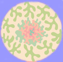
 For
example, this shape, I have realized has its origins in
the petals of California poppies. I first used it in a
1995 painting entitled ‘Poppy Dance.’ At the
time, I was living in Point Reyes and our garden was filled
with these poppies. In this case the journey from the
external environment to the internal is pretty clear. For
example, this shape, I have realized has its origins in
the petals of California poppies. I first used it in a
1995 painting entitled ‘Poppy Dance.’ At the
time, I was living in Point Reyes and our garden was filled
with these poppies. In this case the journey from the
external environment to the internal is pretty clear.
I see my frame of reference
as nature-based. So I think the origins of many of the
shapes are found in the natural environment. Some are
actually negative spaces that you see when you look between
things, like between the leaves of a tree. But as with
the poppy shape, I was using this shape before I associated
it with a feature of the environment.
 Others,
like the biomorphic shapes, strike me as pretty straightforward
expressions of the dynamic, living principle I try to
convey in my work. And yet the similarity between this
shape and a metaphase chromosome is striking. Others,
like the biomorphic shapes, strike me as pretty straightforward
expressions of the dynamic, living principle I try to
convey in my work. And yet the similarity between this
shape and a metaphase chromosome is striking.
|
| Can
your art function symbolically? |
In principle,
I believe so. In my work it would be the shapes that may
carry overt symbolic meaning. The colors, while also potential
carriers of symbolic meaning, are inclined toward cultural
relativism which really limits the penetration of symbolic
meaning.
Of course, it
remains to be determined if the shapes I work with have collective
meaning and thus could function as symbols. Of interest in this regard is the
shape the Japanese call the magatama.
could function as symbols. Of interest in this regard is the
shape the Japanese call the magatama.
I use this shape frequently
and most of us recognize it as part of the Yin/Yang symbol.
It is a Taoist symbol. Arnheim analyzed the magatama from
a Jungian and gestalt perspective seeking the ‘visual
properties on which spontaneous perception of symbolic meaning
is based.’
So if he was
right and Jung was right and the Gestalt psychologists were
right, it is likely that the simple shapes I work with will
turn out to have symbolic meaning. |
| |
|
|
|